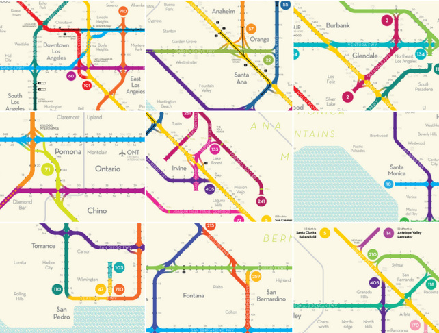
A freeway map of Greater Los Angeles has been smartly re-conceptualized as a subway poster.
Designer Peter Dunn makes clean and stylish improvements to L.A.'s tangled rat-king of roadways by applying an understood aesthetic and navigational logic seen in subway systems. He explains the process on his website Stonebrown Design:
The diagram I’ve designed gives a simplified view of freeway transportation in the greater Los Angeles region by borrowing principles from transit maps. It clarifies connections among a network of 31 freeways stretching across portions of Ventura, Los Angeles, Orange, Riverside, and San Bernardino counties, an area about the size of Connecticut.
With some 75 freeway interchanges and more than 850 exits, the diagram allows Angelenos to trace a route between any of the countless pairs of entrances and exits on a single poster-sized map.
Dunn told Atlantic Cities that he began working on the map in January, finding time at night and on weekends around the schedule of his full-time job with Boston's regional planning agency. "If I'd known ahead of time the real size of the freeway system in L.A., I would have picked something different," he said.
Though Dunn's map isn't as practically useful as modern GPS systems, he still thinks his design is helpful for people who are not as familiar with the area. He hopes simplifying L.A.'s vast web of freeways will give people a clearer idea of how the city's neighborhoods are connected.
"Mapping freeways so they look like subways is a little tongue-in-cheek, no doubt, but it's also an honest attempt to make the overall system more legible," Dunn told KPCC. "And to give L.A. a more iconic representation of the region."
Dunn admits he's never been to L.A., but thinks his lack of knowledge about the area is an advantage.
"If it makes sense to me, it would make sense to other people who are new to the area," Dunn told International Business Times.
The project, funded via a Kickstarter campaign, launched last month and surpassed its $2,000 goal to collect more than $11,000 for map prints and distribution efforts.
Of the monumental undertaking, Dunn hopes to create "a new design language for freeway maps" he asserts on Kickstarter.
The fastidious tinkerer created a set of symbols and design rules to denote direction, entrances and exits to the system, and how they connect. Dunn says of his popular project:
"Add some distinctive typography and a Southern California color palette, and the result is a poster-sized map that’s both legible and stylish.
And as far as I can tell, it’s the only map of its kind."


